







A distributor I work with raises somewhere around 250 invoices a month. Good business, clean books, GST filed on time. Not the kind of client you worry about.
But the last time I sat with their accounts person, she showed me their invoice and I understood why billing took her half the day.
The numbers were all fine. The problem was everything around the numbers. The sales team had been asking for the bank details to show up bigger, because customers kept saying they could not find them. The owner wanted the logo on there properly, not the sad little version in the corner. Dispatch wanted the transporter name printed. And two or three big customers each needed their own terms at the bottom.
None of this had ever been solved. It had been patched. A separate format here, a manual line typed in there, a PDF opened in something else and edited before mailing. Every request had become a little bit of extra work that nobody ever removed.
That is the situation Invoice Personalisation in TallyPrime Release 7.1 is actually built for. Not fancy design. The release brought in ready-made invoice templates you can then shape to your own needs, and most of what it fixes is exactly this kind of accumulated patching.
So here is what you can genuinely change, and, just as usefully, what you still cannot.
Nobody's invoice should look like everybody's
A food distributor wants the FSSAI number where the customer can see it. A pharma firm needs the drug licence number on the document. A trader who lives on logistics wants the carrier or agent name printed. Same broad accounting, completely different documents.
For years the answer to all of this was workarounds. Pre-printed stationery. A second format. Getting a developer to customise something. Or, most often, just living with whatever the default invoice threw out.
TallyPrime 7.1 lets you pick a template and decide what the customer sees on it. Which matters more than it sounds, because your invoice is probably the single document you send out most. It might as well look like it came from you.
Show what they need, drop the rest
Field control is the part I would start with. You can add or remove information from the template, so you decide whether bank details, contact information, extra business information, the party details and the other supported fields actually appear. In the software it is Ctrl+P, then Ctrl+H, then F4 for Add or Remove Field.
Most businesses print too much. Not on purpose, they just never take anything off, because removing a field feels risky and leaving it costs nothing. So the invoice fills up, and the one figure the customer is looking for ends up buried in the middle of it.
If they use it, keep it. If nobody has looked at it in years, take it off. That is more or less the whole rule.
A quick exercise: Print one recent invoice and put it in front of your sales and accounts people together. What do customers keep phoning about? What confuses them? What has just been sitting there for years? You will learn more from that five-minute argument than from scrolling through templates deciding which one looks nicer.

Branding that goes past the logo
Plenty of MSMEs spend properly on branding and then send out an invoice that looks like it belongs to a different, sadder company.
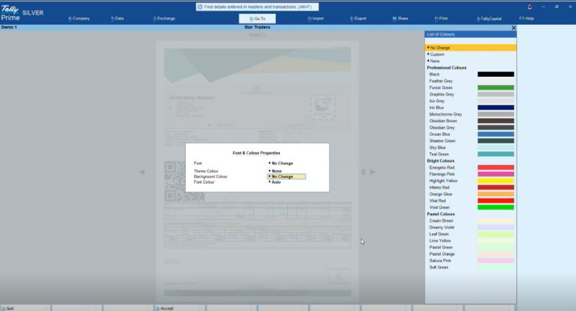
You can change the template's font, the theme colour, the background and the font colour, and if you have exact brand colours you can put in the RGB values. Header and footer images are allowed too, and you can decide whether the header sits on the first page only or repeats on all of them.
The watermark is the bit I did not expect to like. Paid, Duplicate, Cancelled, Confidential, or your own image, with control over its size, colour, opacity and where it sits. A PAID stamp is not decoration. It answers a question before the customer has to ask it. That is worth more than most of the colour options.
Call it what your team calls it
Everyone uses slightly different words. Your people say Bill No., the client's system says Invoice No., and somebody always wants the due date to stand out.
You can rename field titles and change how each one looks, so the important ones can be bold, larger, aligned differently, on their own background. If a wholesaler wants "Payment Due Date: 30 September 2026" to be the thing your eye lands on first, it can be, instead of getting lost among another twenty fields.
Total, payment terms, invoice number, customer reference, delivery details, same idea. This is the point where personalisation stops being about looks and starts being about whether people can find what they need.
The custom fields are the real reason to bother
This is the part that actually got my attention, because Indian businesses almost never need the same paperwork as each other.
The templates take custom fields. At company level you can carry something like an FSSAI number or a drug licence number. At party or invoice level you can pull in the carrier or agent name, the cost centre, other things captured during voucher entry, and have them land in the right place on the printed invoice.
Back to that distributor. Before this, someone was opening a separate format and typing the FSSAI reference onto every single invoice. Two minutes, maybe. You do not notice two minutes. You notice it at the end of the month when you realise it was two minutes, two hundred and fifty times, and most of a working day has gone on retyping the same number.
I am not putting that forward as an official Tally saving, it is just the arithmetic from one client's desk. But that is usually where the case for this stuff is, not in anything dramatic.
A credit note isn't a sales invoice
They do not need to look the same, and you can set different default templates for different voucher types. The one you set at voucher-type level wins over the company default.
So you can run something like this:
|
Document |
What it should get right |
|
Sales invoice |
Branding, payment details, terms |
|
Credit note |
Original reference and a clear adjustment |
|
Delivery document |
Dispatch and transport information |
Design them however suits you. Once a template is saved you can make it the default, and you can lock it to one company or share it across companies on the same machine. If you run a group with several entities, that alone saves redoing the setup every time.
Terms, before the argument and not after
Nobody thinks about their terms until a payment goes bad. Then suddenly the credit period, the delivery conditions, the return policy all matter very much, and none of it was on the invoice.
You can keep several sets of terms and conditions, tie them to voucher types, and pick the right set while printing. Single column or double column, whichever reads better on your layout. It is not glamorous. It is the sort of thing you are glad you set up the one time you actually need it.
Print, PDF, WhatsApp, same document
Almost nobody only prints invoices any more. It gets printed, exported, emailed, sent on WhatsApp.
The template settings carry across all of those, so the thing you set up for printing looks the same when it goes out as a PDF or a message. Which you want. It is a bad look when the paper copy and the WhatsApp copy are visibly two different documents for the same sale.
What it won't do
It is not a free-for-all, and it helps to know that going in. You cannot drag fields wherever you like; positions stay tied to the template layout. The classic Tally format does not take these font, colour and layout changes either, though there is a customisable template close to the classic look if that is what your people are used to.
Honestly I think the limits are fine. An invoice is a document someone has to read quickly, and total design freedom is how you end up with invoices that look designed and read terribly. Professional and complicated are not the same thing.
None of this feels like much until you watch someone raise a few hundred invoices a month. The repeated edits wear the person down, and the cluttered layout wears the customer down, and neither one has to be there.
What 7.1 gives you is control over how the invoice looks and what it says. Use it to show what customers actually need, keep the payment details easy to spot, get your licence and industry fields on there, brand it without wrecking readability, match the template to the voucher type, and keep the printed and shared versions the same.
An invoice should do more than prove a sale happened. On a good day it is one less reason for a customer to hesitate.